RegattaCentral is an online registration platform for rowing clubs and regattas.
MY ROLE
UX Designer
TEAM
2x Software Developer
UX Designer
Account Manager
TOOLS
Adobe XD, Hotjar, Adobe Illustrator
DURATION
2 Weeks
LOCATION
Remote
MY CONTRIBUTIONS
Stakeholder Interviews, Usability Testing, Service Blueprint, Prototyping
MY PROCESS
Empathize
Stakeholder Interviews
User Interviews
Define
Service Blueprint
Prototype
Wireframing
Test
Usability Testing
GOALS
I was tasked with redesigning the club registration forms to reduce abandoned signups and streamline the process for two important form variations: membership and program registration.
CORE USERS
The users span the globe and include mostly rowing parents, athletes, coaches, and club managers. I worked with the stakeholders to narrow the focus to coaches, parents, and athletes.
PRIMARY RESEARCH
I set up two stakeholder interviews to make sure both our expectations were realistic for our time and goals.
The owner and an account manager gave me access to the backend of their custom-designed club management tool and key insights into how the RegattaCentral registration platform works.
RESEARCH RESULTS
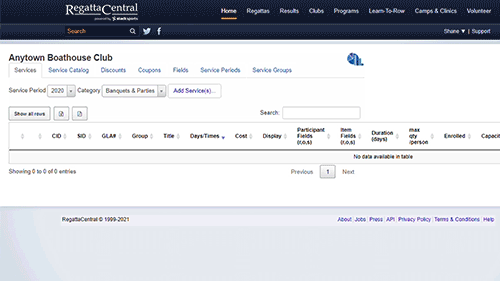
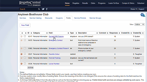
The complexity of the backend led to a website audit of the club registration frontend to help connect some dots. I found the following:
Club managers can customize most form input fields.
Each form is generated based on the category.
The created form is split into Participant Field and Form Field tagsdue to how the backend collects and processes information.
You can not modify form styling.
Each service requires it's own form and each form is split up into two sections of inputs.
Club managers can modify almost everything in input fields.
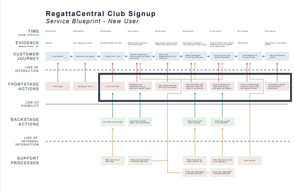
SERVICE BLUEPRINT
The backend complexity was a bit overwhelming, so I drew up a diagram with the help of the developers. This helped me connect dots for the entire business and think through my design.
The portion that I worked on is outlined in dark blue
USABILITY TESTING
The last item I wanted before starting to design was user insights so I put together some moderated user tests. In total, there were four participants, two of which were frequent RegattaCentral users.
In addition to the testing, I requested some HotJar heatmaps to guide my questions on where people were getting stuck.
Heatmap of a user going through the registration process
USABILITY TEST RESULTS
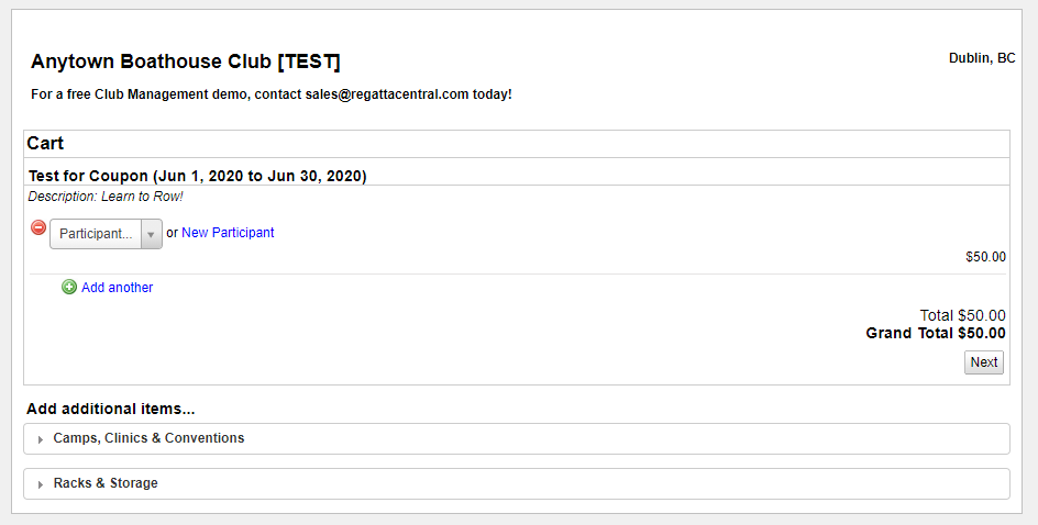
The top navigation menu disappears once you enter the cart page, making it inconvenient for users to easily navigate or exit the form.
Users had a hard time knowing where they were in the registration process.
Pop up information sometimes blocked users from entering information on field inputs.
Some users had a hard time discerning form copy, causing confusion.
The top navigation disappears when going to the cart page.
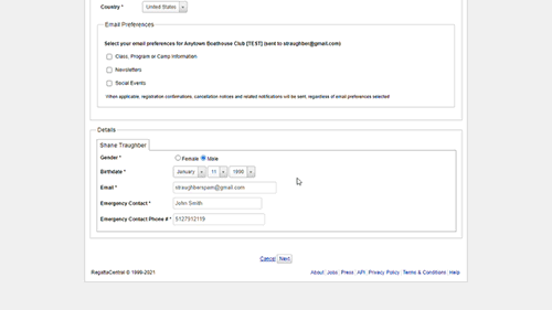
The birthdate field is blocked when clicking into the email field.
WIREFRAMES
Due to time constraints, I went directly into prototyping wireframes to show the developers easy wins they can accomplish. They included consistency of navigation, allowing the user to follow their journey via progress bars, and consistency of styling.
NO NAVIGATION
Users could not easily navigate out of registration due to the lack of a top navigation menu.
SOLUTION
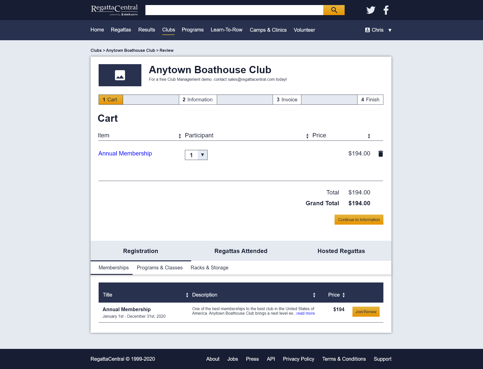
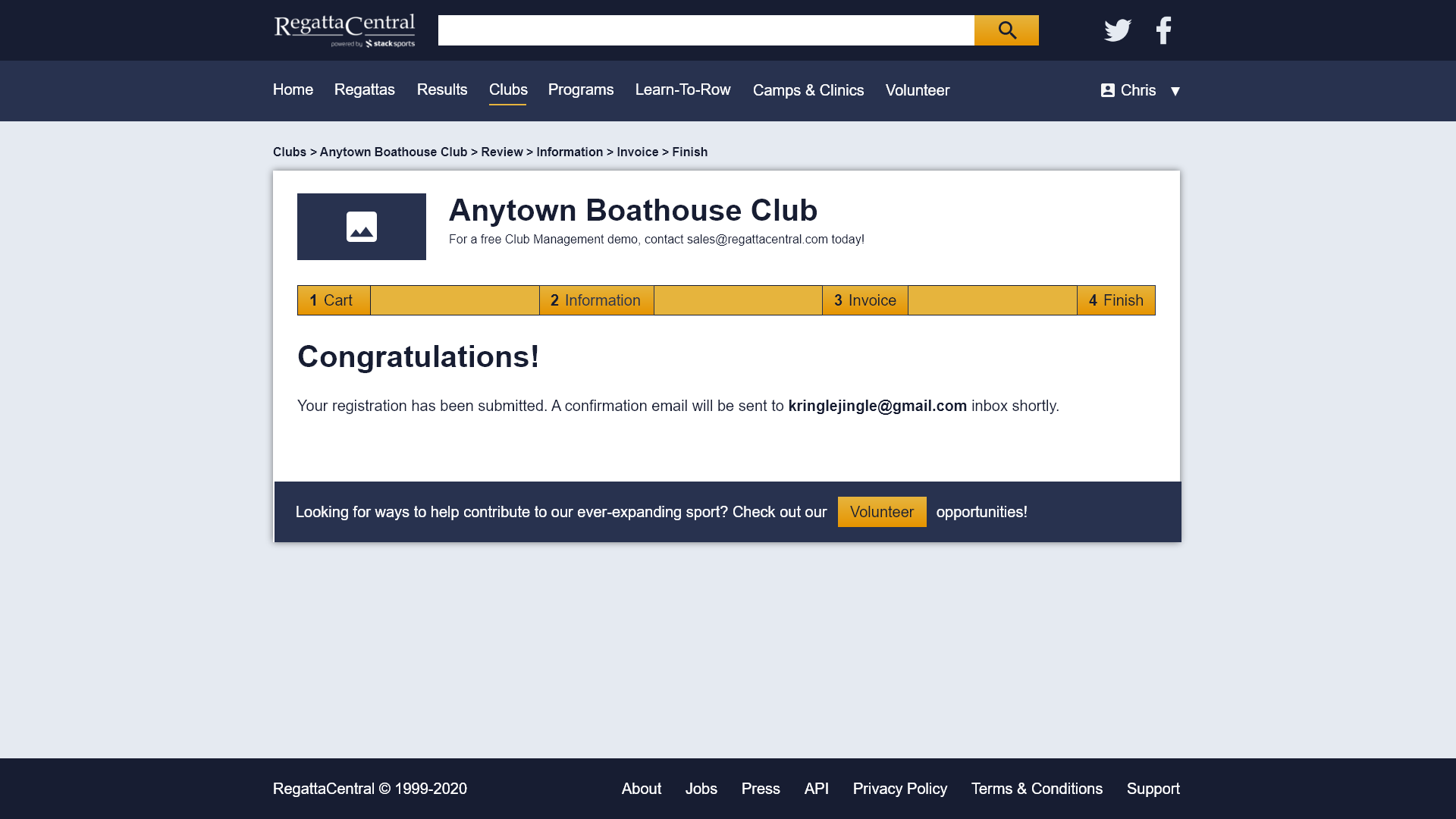
I made sure that the top navigation is present through out the form process.
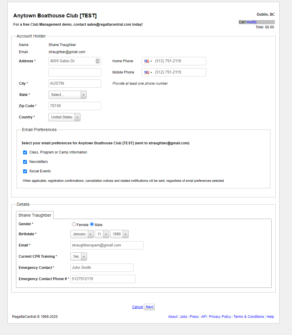
BEFORE
The top navigation disappears as soon as you reach this page.
AFTER
I added a top navigation menu to the registration process.
LACK OF PROGRESS
Users had a hard time knowing where they were in the registration process.
SOLUTION
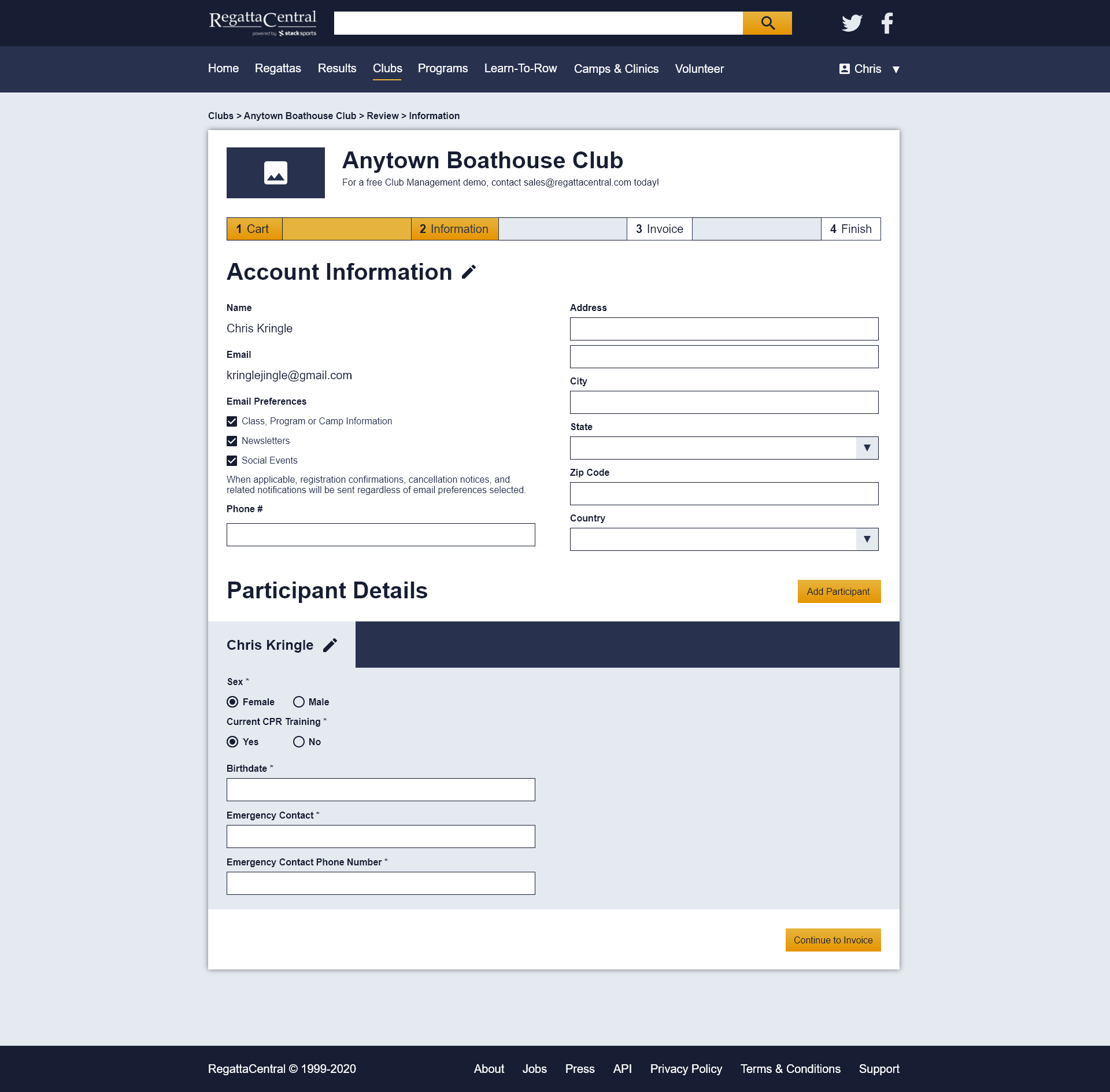
Added a progress bar and breadcrumbs up at the top to add multiple ways for users to know where they are in the registration process.
BEFORE
There is no way to tell where you are in the checkout process.
AFTER
The progress bar and breadcrumbs allow for better navigation through the checkout process.
BLOCKING INPUTS
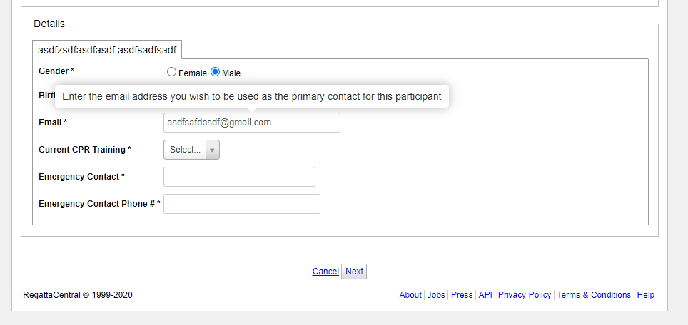
Pop-up information will cover the input above and block users from inputting information unless they click away.
SOLUTION
Remove the superfluous information in pop-ups and put it next to or below the input field if needed.
BEFORE
Clicking on input fields makes a pop-up that blocks other inputs.
AFTER
There is no need for a pop-up when the input field is labeled correctly.
STYLE CONSISTENCY
Some users had a hard time discerning form copy, causing confusion.
SOLUTION
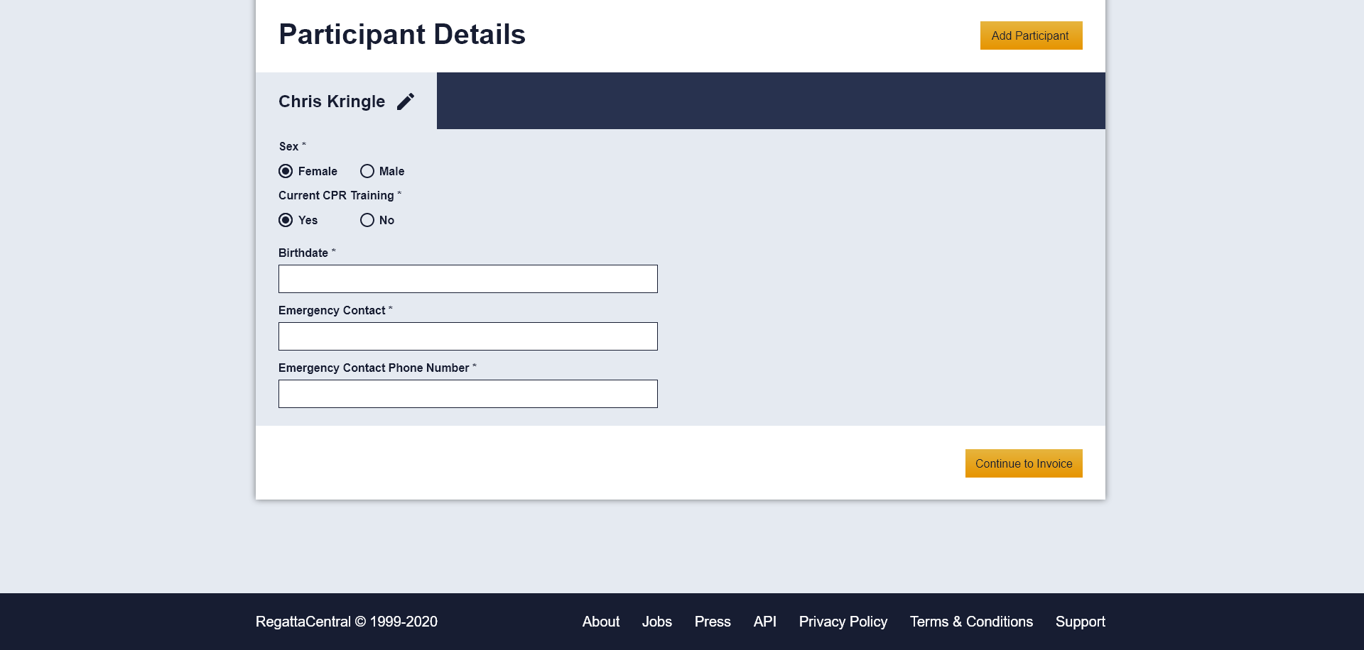
Made consistent font, color, spacing, and style choices to increase readability.
BEFORE
AFTER
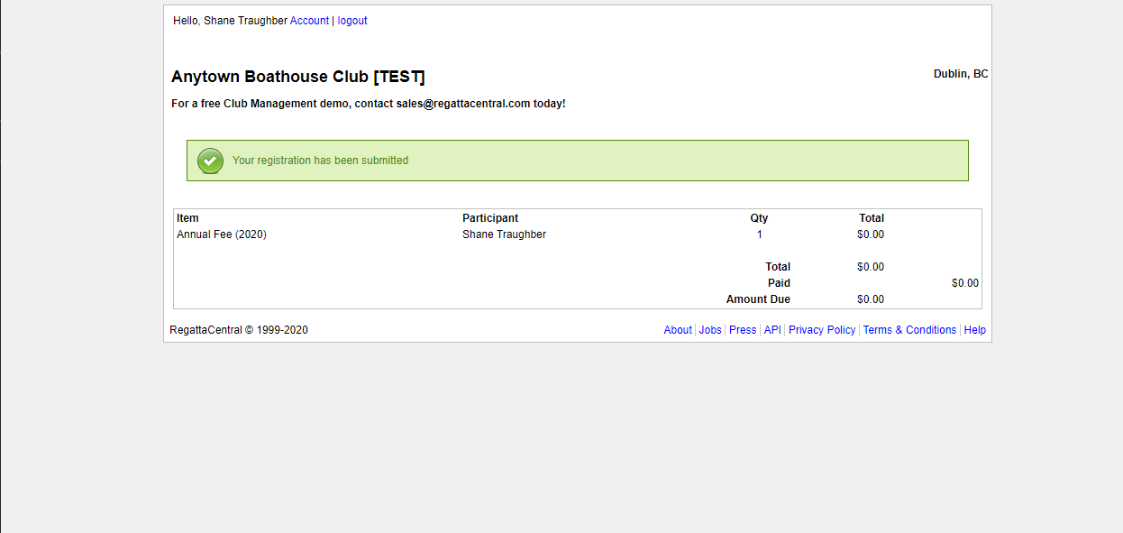
Interactable prototype
WORK TO BE DONE
Better copy is still needed to make sure users are not confused.
User testing on the prototypes and a second iteration of designs.
Make sure there is a way for user information to transfer between all screens.
A style guide for consistency throughout the whole website.
A club backend redesign to allow for a better front-end user experience.
WHAT I'VE LEARNED
This was quite a daunting challenge due to the backend complexity adding constraints to my design.
A proper understanding of how a whole product/website works is essential to making smart design decisions.
Due to time constraints, I was not able to design and test everything I want.
Proper justification for design decisions is imperative.