Trhane is an application to help endurance athletes figure out their nutrition and hydration for training and events.
MY ROLE
Lead UI/UX Designer
TEAM
Solo
TOOLS
Adobe XD, Adobe Illustrator, Miro, Marvel, and Google Slides
DURATION
2 Months
LOCATION
Remote
MY CONTRIBUTIONS
Competitive Research, Survey, Diary Study, User Research, Personas, User Story, Userflow, Concept Ideation, Wireframes, Wireflows, Prototyping
MY PROCESS
Empathize
Competitve Research
Online Surveys
Diary Study
User Interviews
Define
Empathy Mapping
Personas
HMW Statements
Ideate
User Story
Sitemap
Userflow
Sketching
Prototype
Guerilla Testing
Wireframing
Wireflows
Low Fidelity Prototype
High Fidelity Prototype
Test
Geurilla Testing
User Testing
Prototype Testing
THE PROBLEM
In the world of sports nutrition, there are hundreds of options and opinions telling athletes what they need to eat and drink to perform their best. The vast sea of information confuses athletes and prompts the question:
How do you help endurance athletes easily learn their nutrition and hydration needs for exercise?
MY KNOWLEDGE
I have been doing nutrition consulting for endurance athletes as my job for almost a decade. While this gives me a great deal of insight into some of the problems, it also applies blinders because of my preconceptions.
I’m hoping through proper research I can figure out new and exciting ways to see the problem and tackle it.
COMPETITIVE RESEARCH
Before I started to build my product, I needed to see what strengths and weaknesses the competition brings to the table.
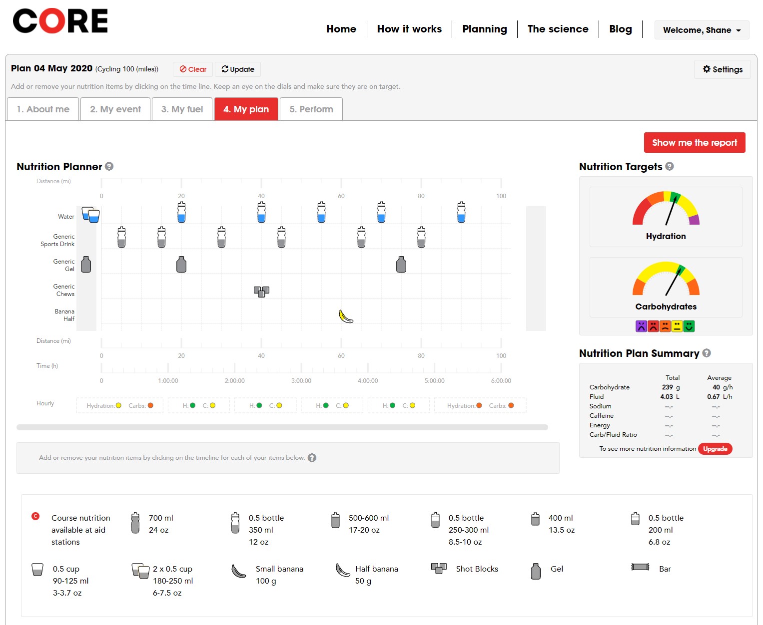
CORE NUTRITION PLANNING
This is the best option currently on the market. It is a webapp, has few important features, and the UX is confusing.
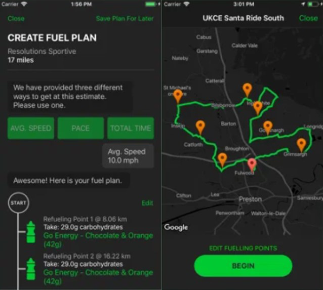
ENDUR8
This phone application has a great notification system for racing and training, but lacks the customization needed for proper hydration in different environments.
ENDURAID
This app is focused primarily on running, but the user interface leaves room for improvement.
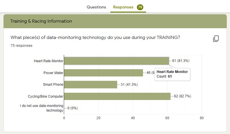
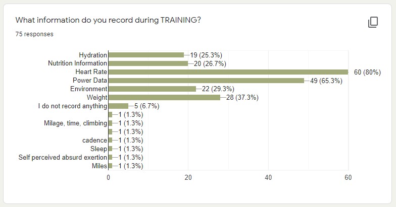
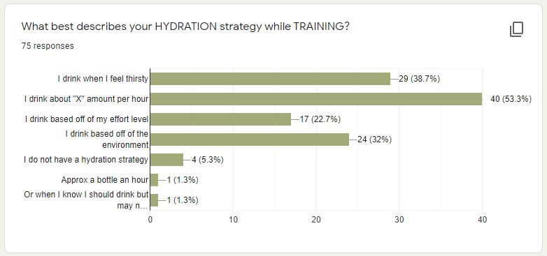
100% of the athletes use some form of data recording technology or app
30% record nutrition and hydration during training or racing
60% have little knowledge of their nutrition and hydration needs
SURVEY
I wanted a broad feel of the problems facing the athletes who would use this app so I built a google survey and sent it out to the cycling and ultra-endurance Facebook groups I’m a part of.
HYPOTHESIS
Do athletes know what their nutrition and hydration needs are?
What tools are athletes using to track their nutrition and hydration needs?
FINDINGS
An education gap when it comes to personal hydration and nutrition knowledge.
The lack of an easy way to record nutrition and hydration.
DIARY STUDY
I needed qualitative data in addition to quantitative.
9 out of the 79 participants followed through with the diary study.
CONCLUSION
All athletes strongly believe that nutrition and hydration are important to the success of their training.
A majority of the athletes wanted to learn more about their nutrition and hydration.
A majority of them had at least one symptom of improper fueling during their training.
Only one athlete regularly tracked nutrition and hydration data.
USER INTERVIEWS
I did not get all the answers I wanted from the diary study, so I decided to obtain more insights and underlying motivations by interviewing the participants.
Five of the nine participants agreed to user interviews through Zoom.
FINDINGS
Athletes know that nutrition and hydration are important, but some don’t know where to start in the process of learning.
A lot of the athletes started by asking friends first or going to a sports dietitian. They went to a trusted source for nutrition advice.
None of the athletes had or knew of an application or website that could track or educate them on sports nutrition. The one athlete that does track, does it manually on a spreadsheet he created.
All athletes want an easy program to help them track, learn, or tell them what to do.
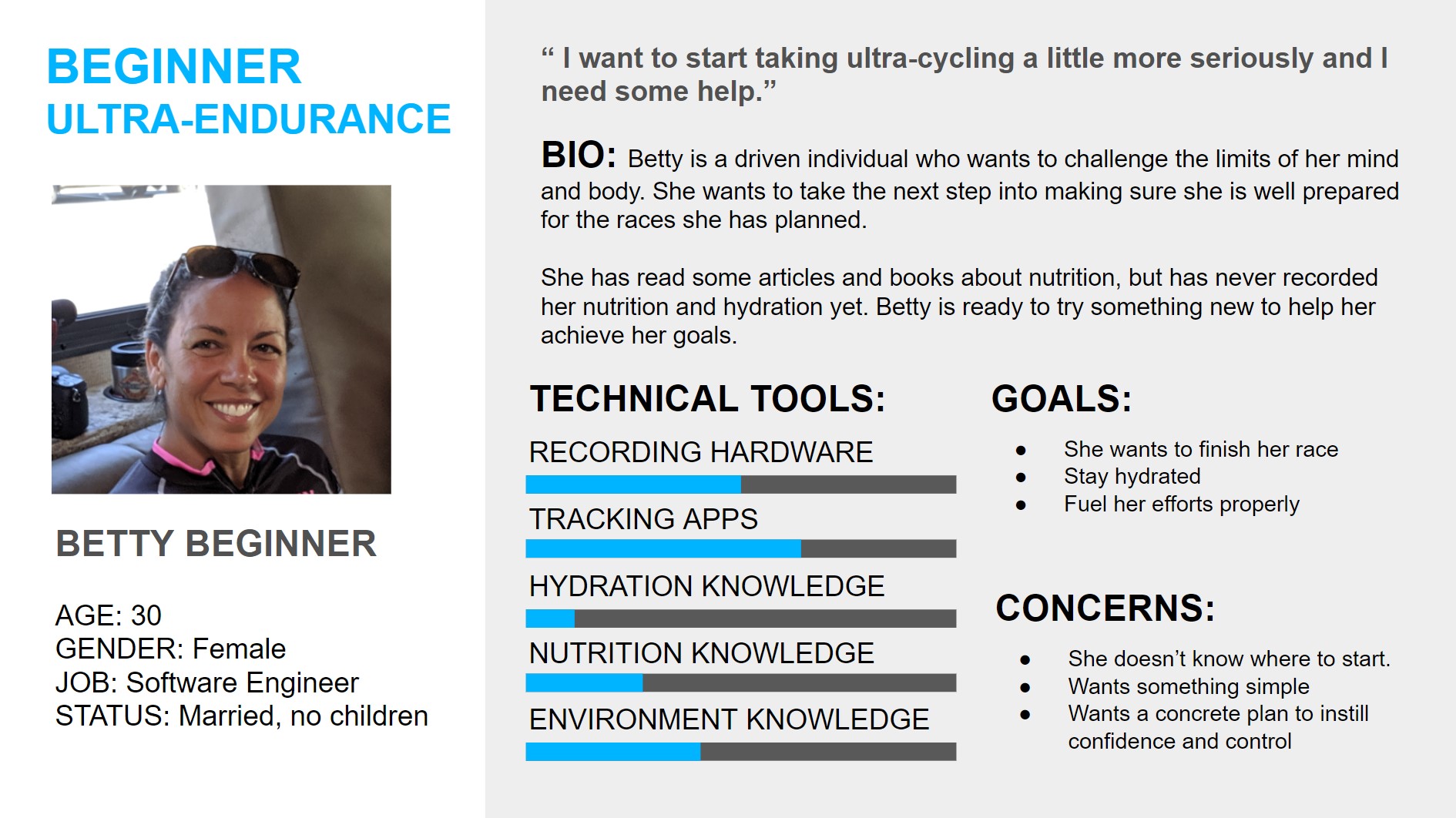
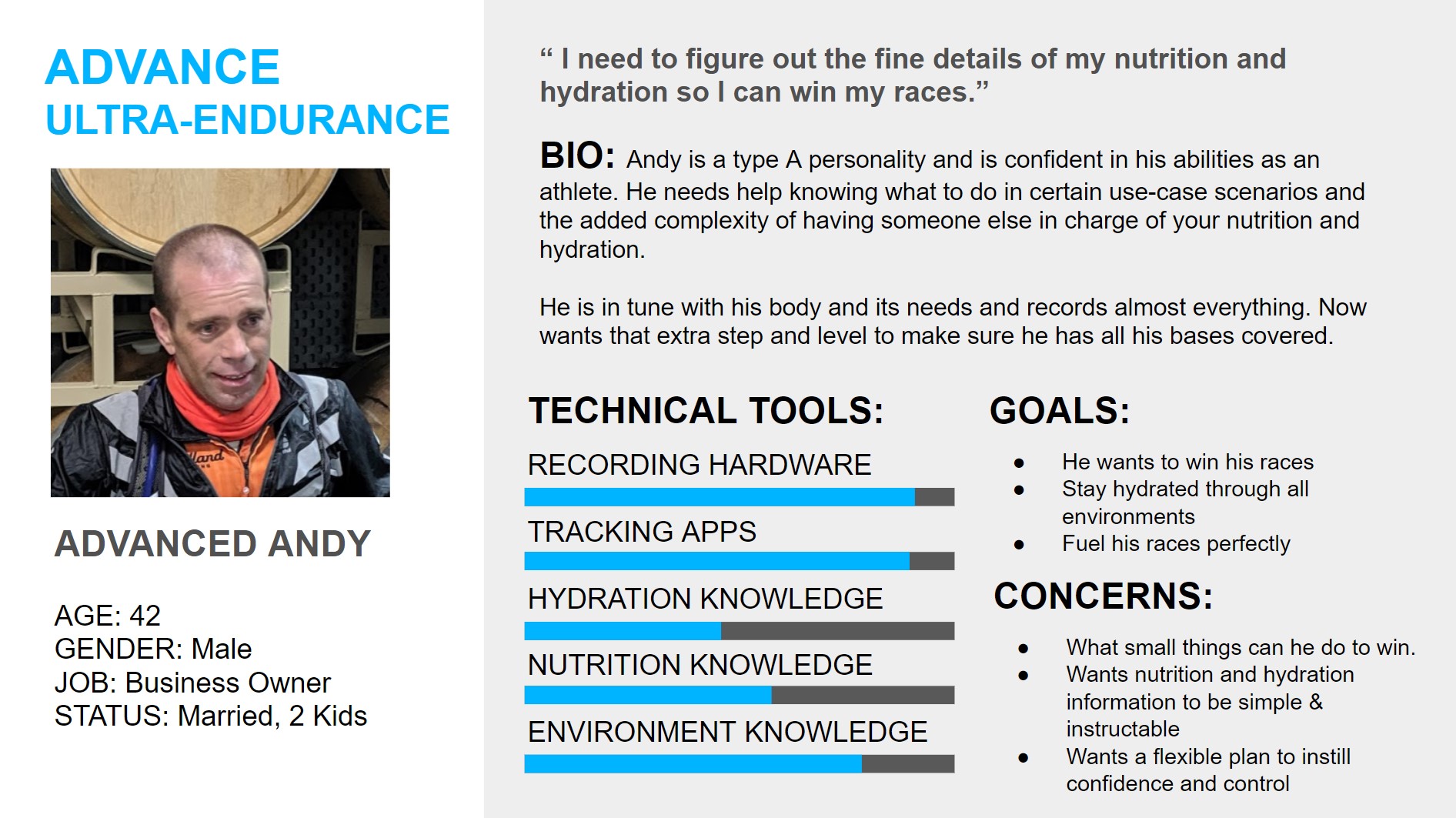
PERSONAS
Betty Beginner will be the primary persona I design for during my MVP, with Advanced Andy only really showing up in later phases.
How might we make nutrition and hydration needs simpler overall and specifically during training?
My application broken down into the four phases it will need to become a functioning application for athletes. This Case Study only covers the MVP.
USER STORY
After plenty of rough sketching and brainstorming, I made a lot of post-it notes of course!
I organized all the ideas into four phases and nailed down what I needed my MVP to look like so I can focus on creating without the feature creep.
SITEMAP
After multiple revisions, I simplified the sitemap for the MVP as much as possible to reduce the work load for designing.
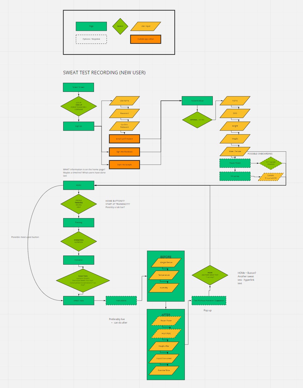
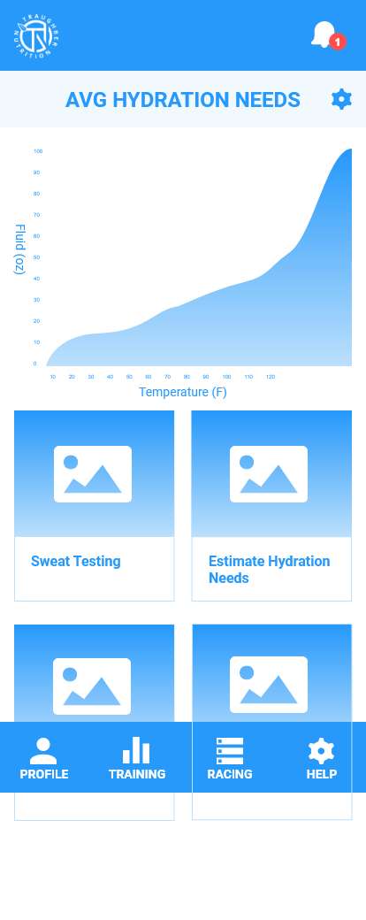
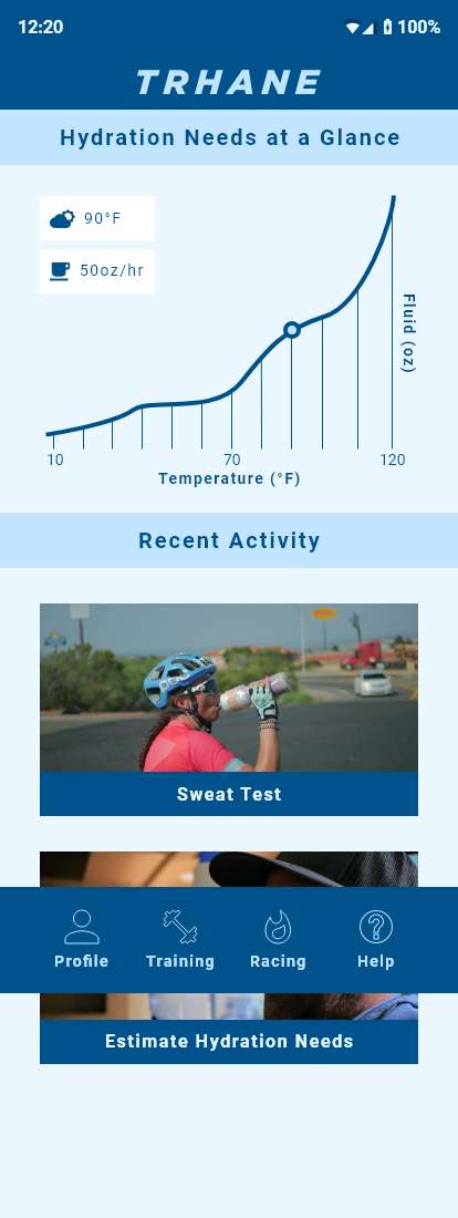
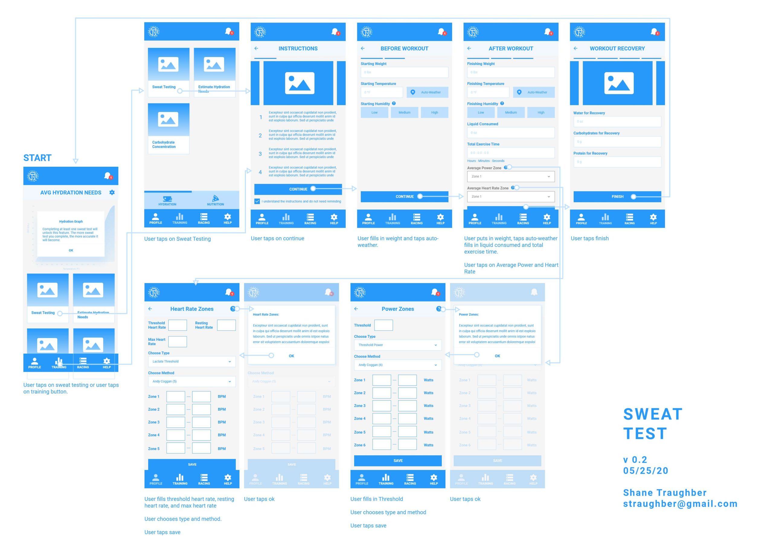
SWEAT TEST USERFLOW
Sweat Test User Flow
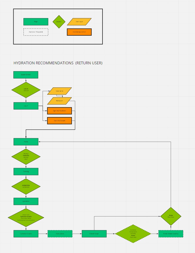
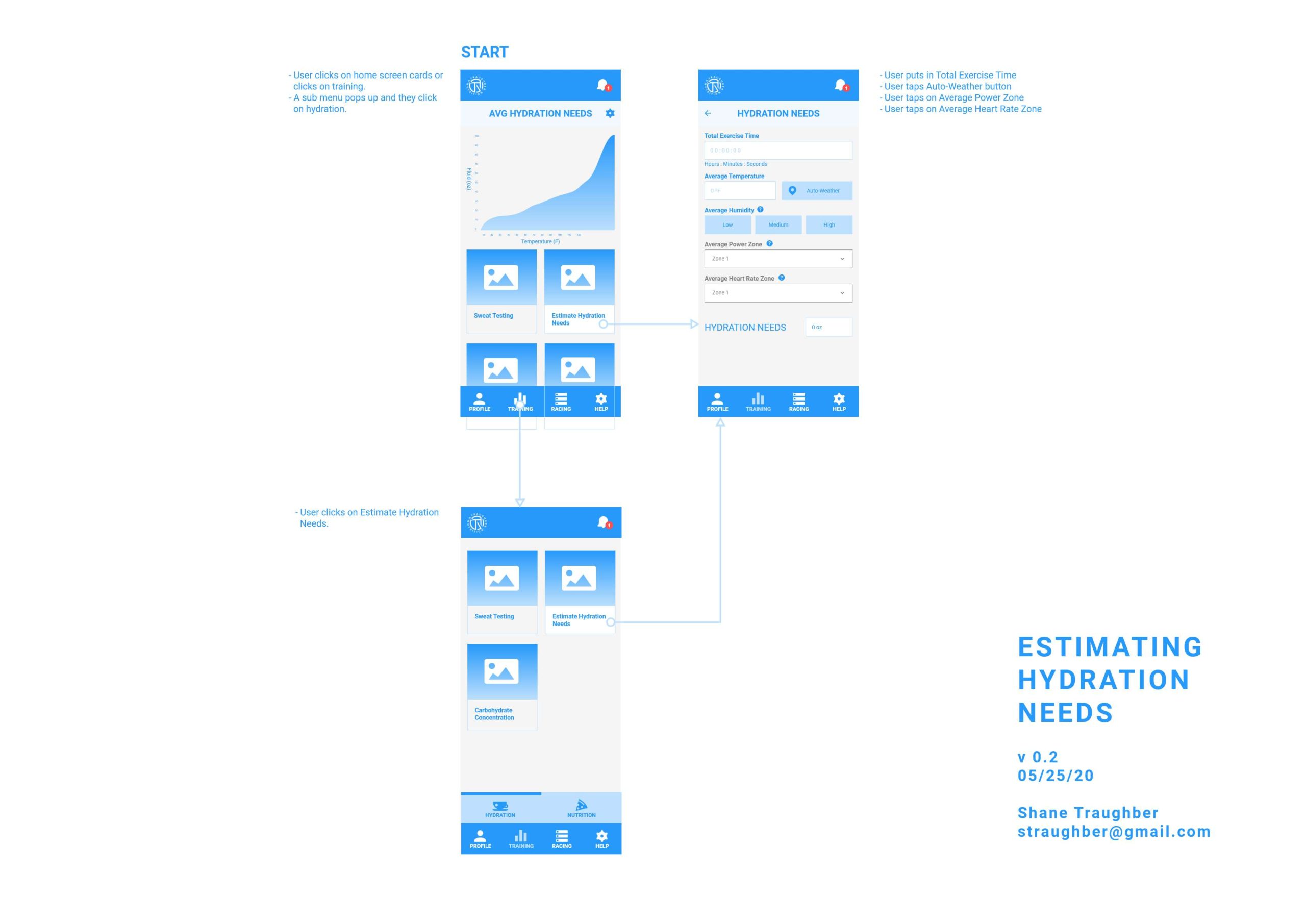
HYDRATION EST. USERFLOW
Hydration Estimation User Flow
SKETCHES
I prototyped out some of my sketches using the Marvel App and completed 5 rounds of user testing.
FINDINGS
“There is too much information on screens like the account set up or sweat test. Breaking it up into sections could make it easier to read.”
The onboarding for account creation needs better copy and be broken up better. Some of the terms and copy used would not be known to beginner users.
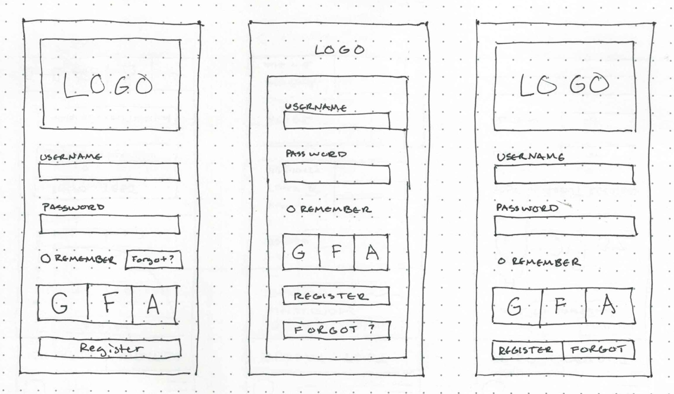
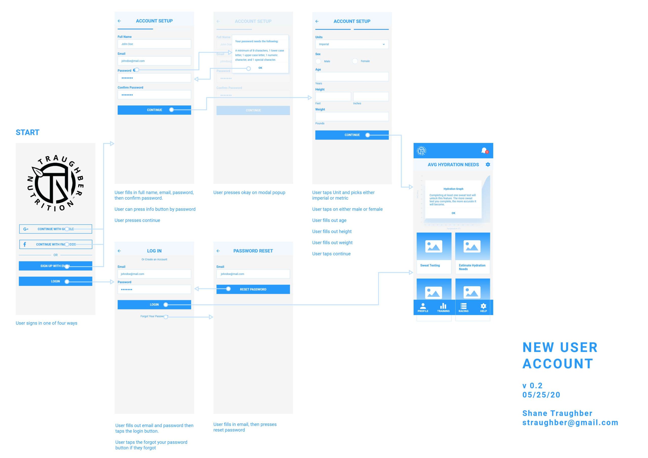
Wireframes were then built from the combination of guerilla testing results, user flows, and personas.
I built out the three red routes in Adobe XD a user would take when using my app:
Account creation
Sweat tests
Hydration estimation
WIREFRAME USER TESTING
This time I was able to secure five different endurance athletes to test the wireframes. It was all completed through moderated remote video due to the increasing COVID-19 concerns.
The testees came from cycling and running backgrounds, were of both sexes, and a wide age range.
FINDINGS
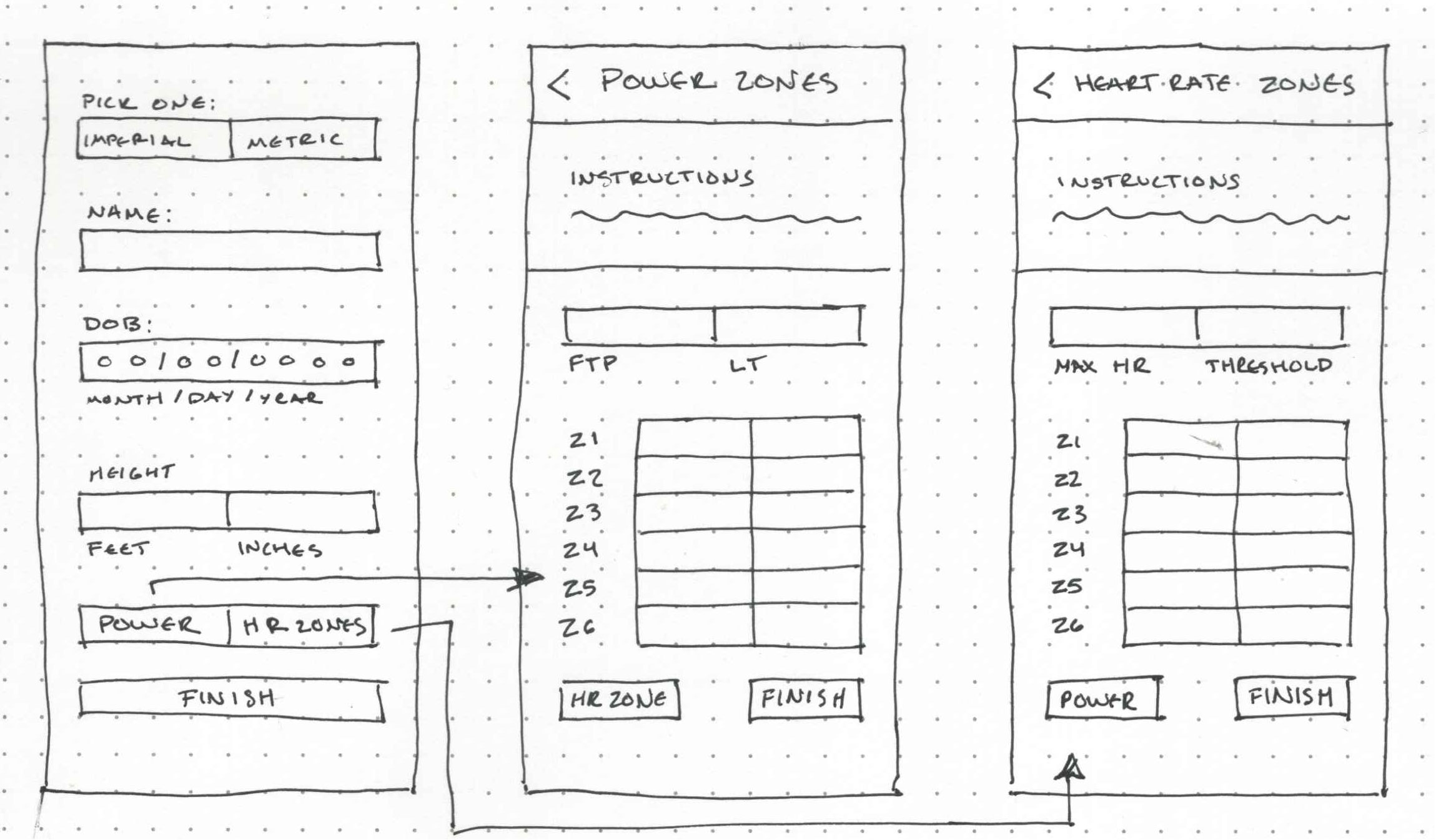
Users wanted to know where exactly they should put their heart rate and power data zones. I could end up putting options in the account creation, sweat test, and hydration process.
Sweat Test instructions could be split up into multiple slides at different portions of the sweat test to facilitate better learning.
Input fields can be more consistent to provide better readability.
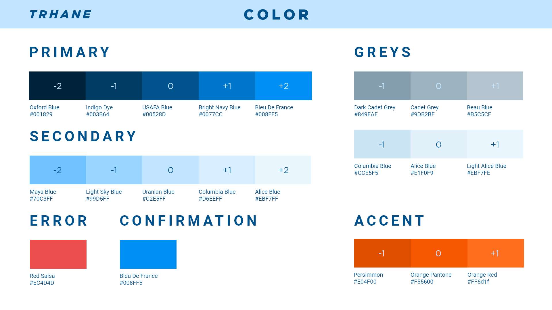
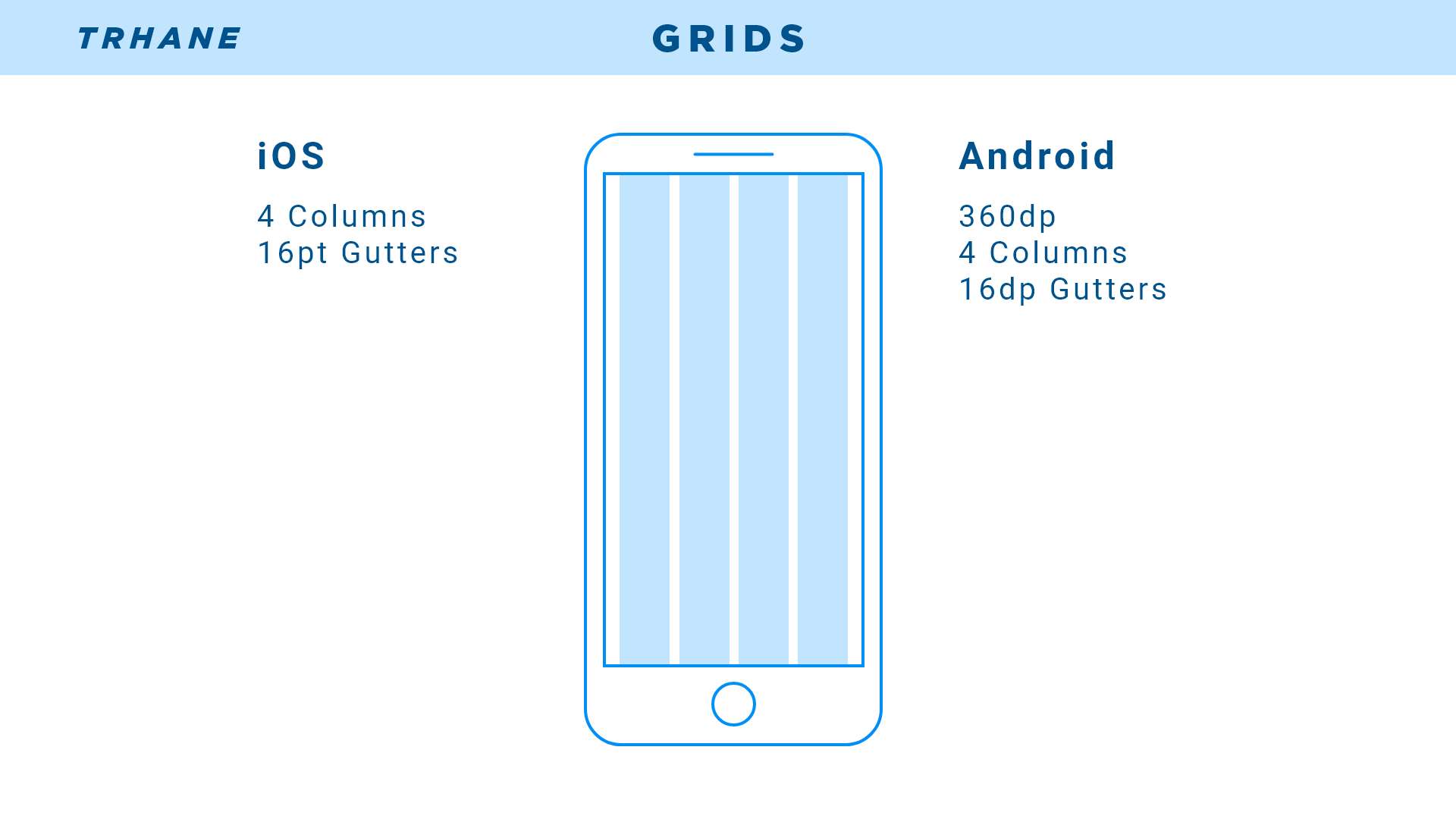
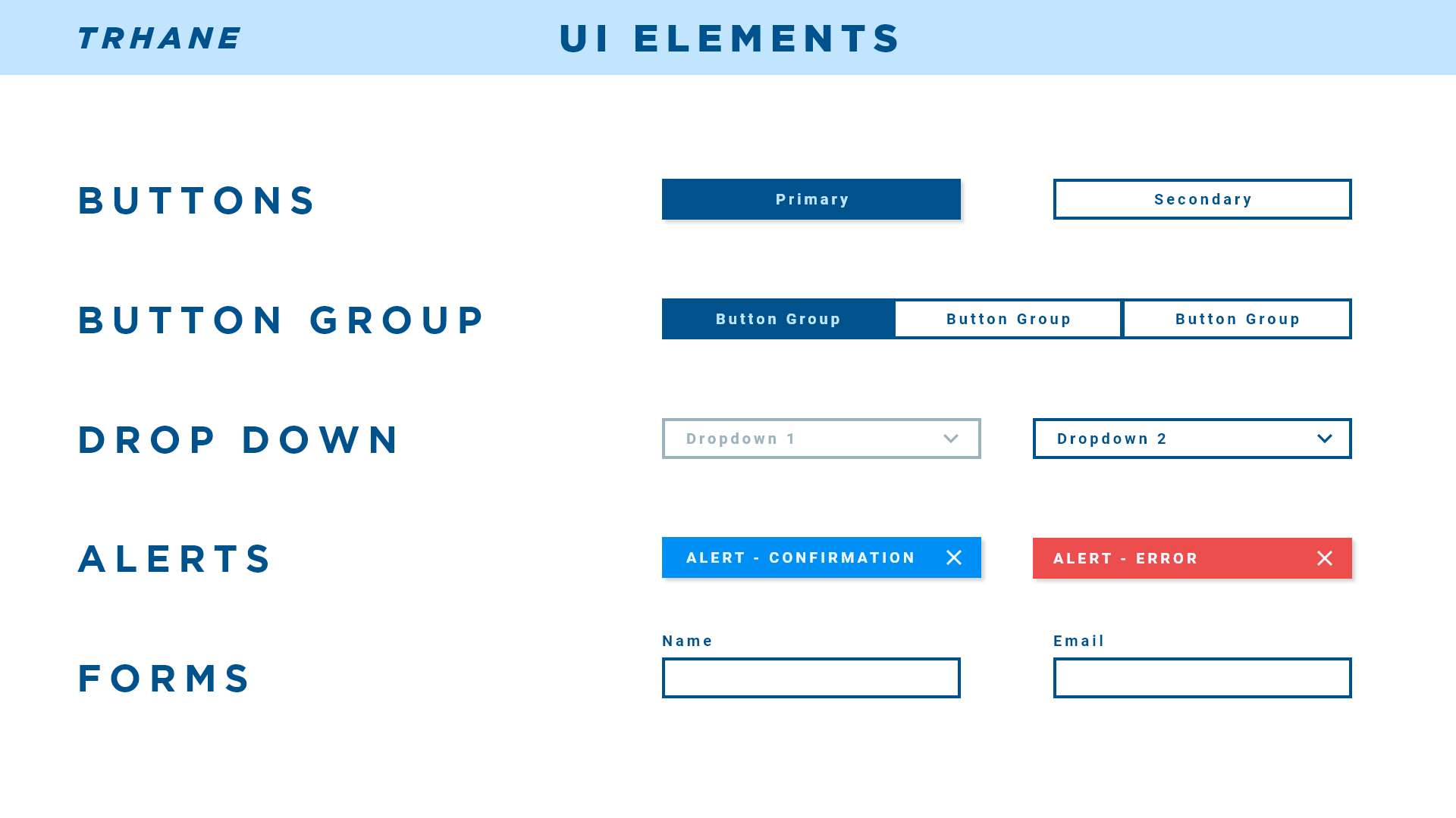
STYLE GUIDE
Before the high-fidelity prototypes were constructed, I wanted to create a style guide to help the overall design process’s speed and consistency.
PROTOTYPE & TEST
I built out the prototype and did one final round of user testing with another five endurance athletes.
This time the endurance athletes included triathletes and cyclists, were both sexes, and a wide age ranges.
The users managed to identify multiple pain points that still need to be worked on.
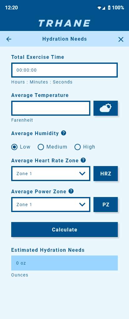
BEFORE
AFTER
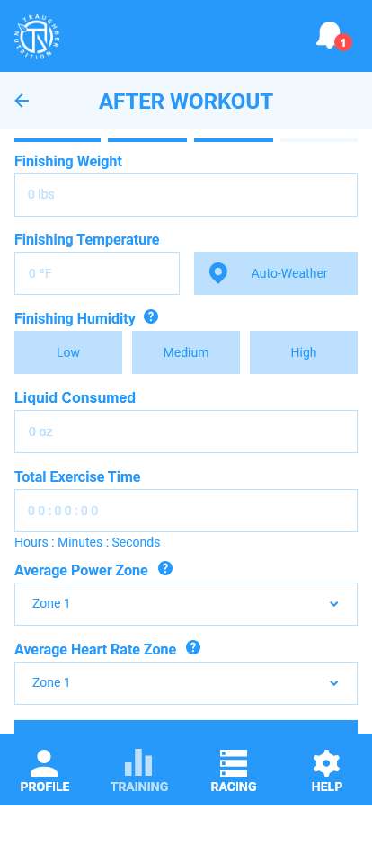
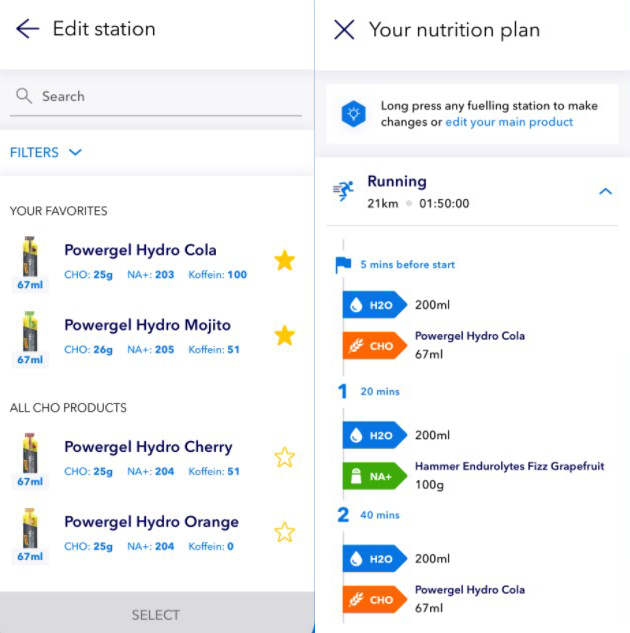
I am used to seeing heart rate and power in zones because I coach people. This is not what the athlete sees on a daily basis.
PROBLEM
The copy for heart rate and power zones needs to be similar to how they will see it out in the real world.
CONSTRAINT(S)
Users need to have heart rate or power data. What if they don’t have that data?
SOLUTION
Rather than Zone 1, 2, etc. make it a number they can enter and it will auto-calculate it on the backend. I also need to design for scenarios where there is no heartrate or power data.
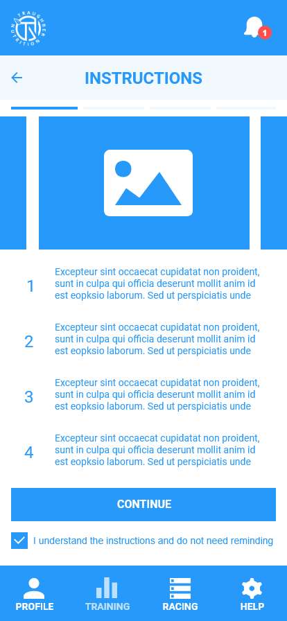
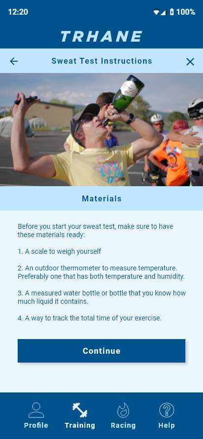
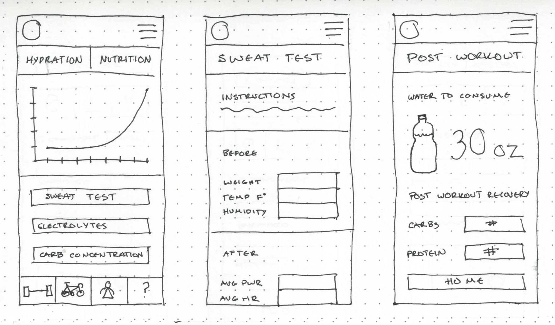
BEFORE
AFTER
There needs to be a better way to illustrate what to do during the instructions. Also, it's still too wordy.
PROBLEM
The instructions need to be concise and clear to the user.
CONSTRAINT(S)
The athlete might not have a scale or some other additional way to measure numbers.
SOLUTION
The next step outside of writing it down should be proper illustrations, videos, or gifs of what to do with simpler and concise text.
BEFORE
AFTER
The coffee cup icon made some users think it was time to caffeinate it up!
PROBLEM
The iconography needs to be relevant to the user.
CONSTRAINT(S)
Icon familiarity relies on the user.
SOLUTION
Make custom icons and more user testing specifically on icons.
PROTOTYPE
WORK TO BE DONE
Power and heart rate pages need better education and explanation to help users understand how it can be useful to them in regards to nutrition and hydration.
The heart rate and power zone inputs need to be redesigned to include the edge cases of athletes with no access to power or heart rate data.
I need to rework the sweat test instruction page to be clearer by using more visuals and fewer words. This will decrease the mental load an athlete has to use in order to complete a proper sweat test.
Proper iconography and copy can help the user better understand instructions.
WHAT I'VE LEARNED
The onboarding education for pages like sweat tests, heart rate, and power is key to ensuring the user knows WHY they are useful.
When there is too much text on instructions, it can confuse some users.
Properly categorizing forms and feeding them to the user at the right pace helps avoid cognitive overload. It is essential after an athlete has done intense exercise due to thinking impairment.